
A good advertisement serves a clear purpose
Your product ad can look polished and still leave shoppers unsure what they are buying. A good advertisement makes the product and its relevant buying reason understandable, supports that message with evidence, and leads to a useful next step. It earns attention, gives that attention somewhere useful to go, and keeps its claims consistent with the actual offer.
The goal determines evaluation. A product-explanation ad should make the product easier to understand. A response ad should support the intended action. Neither an attractive design nor a high click count, by itself, establishes success across all goals.
Amazon Ads’ effective advertising guide connects message clarity, visuals, placement, and a next action, then recommends evaluating results against the campaign goal. For your store, translate those principles into two reviews: whether the creative helps someone judge the product, and whether the delivered campaign achieves the intended outcome.
The nine elements below are our practical editorial review framework. Use them to identify a concrete problem and the next revision; they are not an industry-wide scoring standard or a prediction model.
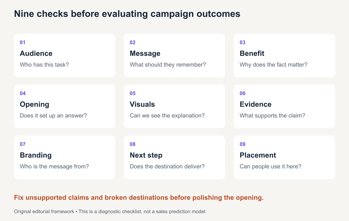
9 elements of a good advertisement
1. A defined audience
Check: Can you name the person and situation where the message matters?
“Everyone who wants a better life” does not guide a useful creative choice. “Someone checking whether an organizer fits beside a keyboard” does. It suggests dimensions, a realistic desk view, and a destination with the measurements.
Do not mistake a narrow scenario for a proven market segment. Use customer research and distribution data to evaluate whether enough relevant people share the need.
2. One clear message
Check: What should the viewer be able to repeat after seeing the ad once?
For a fictional tray, “one removable divider gives two configurations” is a clear message. Combining that with an unconnected founder story, a productivity claim, and a seasonal sale can hide the point.
Keep supporting details when they help the decision. A dimension may support the configuration story; an unrelated slogan may not.
3. A meaningful benefit
Check: Does the feature change something the intended buyer is trying to do?
A removable divider matters when someone wants to switch layouts. “Premium organization” does not explain that use. Connect the product fact to the task, while keeping the promise within the evidence.
Use the FAB framework when the draft jumps from a feature directly to an exaggerated life outcome.
4. An attention-worthy opening
Check: Does the opening attract the right person and set up a promise the ad answers?
A close-up of a divider being removed can create interest while introducing the product. An unrelated startling scene may attract attention that the rest of the ad cannot use.
Avoid opening with a question you never answer. If the opening asks whether the tray fits a small desk, include the footprint or a relevant demonstration.
5. Visuals that support the message
Check: Could someone point to the visible evidence for the claim?
Show both layouts at the same scale. Keep the product large enough to inspect and use a continuous action when continuity matters. A rapid montage can obscure the exact thing a shopper wants to understand.
Illustration has a useful role in explanation. Label it when a viewer might otherwise mistake a concept for actual product footage. A render cannot verify physical fit or tested performance.
6. Credible evidence
Check: What source supports each consequential claim, and does it apply to this variant?
Measurements need a method. Comparisons need a fair baseline. Testimonials need real experiences and appropriate permission or disclosure. An actor’s scripted line should not become a purported customer review.
Keep conditions close to the result. “Fits this model under these conditions” is more defensible than “fits everything.” If evidence is missing, narrow or remove the claim before adding decorative proof signals.
7. Recognizable branding
Check: Can a viewer connect the message to the advertised product or brand?
Show the product name and use recognizable visual identity without crowding the demonstration. A product can be the branding vehicle when it is distinctive and identifiable.
An ending logo cannot always repair an ad whose story could belong to anyone. Check product recognition with someone unfamiliar with the draft rather than assuming the internal team’s knowledge transfers.
8. A clear next step
Check: Does the requested action follow from the message, and does the destination fulfill it?
“See both layouts and dimensions” should open that information for the same item. Sending the viewer to a general homepage adds a new search task.
The CTA tutorial shows how to audit wording, requirements, and downstream completion. Clear direction is useful only when the promised step exists.
9. A suitable placement and context
Check: Can people understand the ad in the actual viewing environment?
Preview text at phone size, check crop and interface overlap, and consider whether audio is likely to be heard. Adapt the next-step instruction to the actions available in that placement.
A design reviewed only as a large desktop image can conceal unreadable conditions. Evaluate the delivered file, not just the working canvas.
How these elements work together: 3 annotated examples
All examples below are fictional teaching concepts, not real campaigns or measured winners.
A product-demonstration video
Concept: A tray with a removable divider, shown in two configurations.
Opening: “One tray. Two layouts.” Picture: The actual divider being removed, followed by matched views. Support: Accurate dimensions and included items. Ending: “View both layouts and dimensions.”
The message, visual, and next step align. The weakest version would cut away during removal, show a different tray, or promise a productivity result. For a complete production example, see how to create a commercial video.
A static clothing ad
Concept: An unlined overshirt shown open and buttoned over the same tee.
Headline: “Wear it open. Button it up.” Support: Verified composition, construction, and a fit-table destination. Ending: “Compare garment measurements.”
The two views support styling flexibility. They do not establish weather protection or universal fit. A strong revision adds accurate worn-size information and keeps the selected color consistent with the destination.
A brand-introduction video
Concept: A fictional repair workshop explains a documented replaceable-panel design.
Opening: A worn base panel beside a replacement. Story: A maker explains the actual replacement process. Evidence: Verified compatible models and service terms. Ending: “Check repair eligibility.”
Here the brand’s meaning comes through a concrete service decision. A vague sustainability montage would add less explanation. Do not claim an environmental saving without evidence covering the relevant lifecycle and assumptions.
Diagnose a product ad before ordering another edit
Watch the ad once at its intended size, then open its destination. Work from the earliest unresolved decision:
| What a new viewer cannot answer | Inspect | Specific revision |
|---|---|---|
| What is being sold? | Opening image, product name, and visible bundle | Show the item clearly and identify it earlier |
| Why would I choose it? | Main message and buyer situation | Replace a generic adjective with a demonstrated use |
| Can I believe the claim? | Source and proof shot | Add the needed evidence or narrow the claim |
| Will it suit me? | Fit, dimensions, compatibility, and variants | Give the relevant selection information |
| What happens after I click? | CTA and actual landing page | Link the featured item and make the promised information accessible |
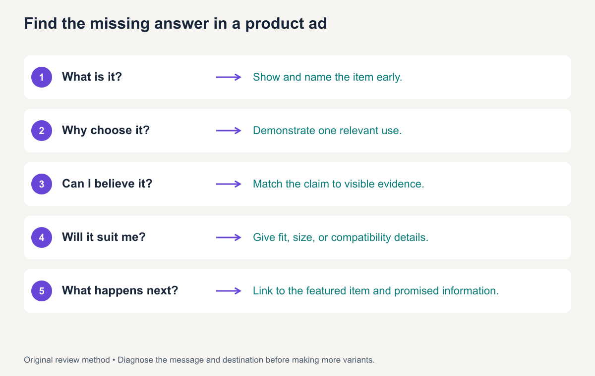
If the video asks “Will it fit beside your keyboard?” but only shows the divider moving, adding another hook will leave the same gap. Put the footprint in the ad and make the dimension information available on the page. Record that precise change in the review worksheet.
Attention, clicks, and sales measure different things
Evaluate the goal and the stage separately:
| Measure | Useful question | Important limitation |
|---|---|---|
| Reach and views | Was the ad exposed to people under this platform’s definition? | Different platforms count differently |
| Watch behavior | Where do viewers continue or stop? | Watching does not establish understanding or intent |
| Click rate | Do people activate the available link? | More clicks can include less qualified interest |
| Completion rate | Do assigned users finish the target action? | Destination, eligibility, and measurement affect it |
| Incremental outcome | What changed because of the advertising? | Requires a design suited to causal inference |
An invented example makes the distinction visible: one ad gets 200 clicks and 10 orders; another gets 300 clicks and 9 orders from equal exposure. The second has more clicks, while the observed order count is lower. Neither small aggregate result, by itself, proves which creative caused a better business outcome.
Record audience, placement, spend, offer, destination, and attribution window with the result. A creative review can expose a mismatch before launch; it cannot isolate all those variables after the fact.
A practical advertisement review checklist
Use yes, no, or needs evidence for each item. Do not reduce the answer to a single score that conceals a false claim.
| Priority | Review question | First action when it fails |
|---|---|---|
| Blocking | Are the product facts and claims supported? | Remove, narrow, or substantiate the claim |
| Blocking | Does the destination match the product, terms, and CTA? | Repair the journey |
| High | Can the audience identify the product and main message? | Simplify the message and show the object |
| High | Do the visuals explain the important fact? | Capture or create the required evidence |
| High | Is critical information readable in the placement? | Reframe, resize, or allow more time |
| Improvement | Is the opening relevant and memorable? | Test a different opening with the core explanation stable |
Download the nine-element review worksheet. Assign an owner to unresolved items and keep the supporting source with the claim.
How to improve a weak advertisement
Start with this fictional draft: “Transform your life with the ultimate organizer. Buy now!” It names no object, gives no evidence, and asks for a purchase before explaining the product.
Revise in stages:
- Define the task: Organize small desk items in a known footprint.
- Replace the vague promise: “One tray. Two layouts.”
- Add the evidence: Show the divider installed and removed at matching scale.
- Resolve a buying question: Add the external dimensions and included items.
- Match the next step: “See layouts and dimensions,” linked to the relevant product details.
The revised body could read: “Use the removable divider for two sections, or lift it out for one open space. External size: 24 × 16 × 3 cm. Includes one tray and one divider.” These are fictional teaching specifications.
This revision improves clarity and support. It is not evidence of a conversion lift. A real comparison needs a planned test, consistent measurement, and enough information to interpret the outcome.
Use your diagnosis to draft a revised product-video script in ReelFlock. Name the missing buyer answer, retain the supported claims, and review the new draft with the same checklist.
Frequently asked questions
Does a good advertisement need to be funny?
No. Humor is one creative choice. A clear demonstration, useful answer, or distinctive story may fit the audience and goal better. Check whether the device supports product recognition and the message.
Can a simple advertisement be effective?
Yes, but simplicity alone is not evidence of effectiveness. A short ad can communicate a supported message clearly. Evaluate its actual outcome against the goal and distribution context.
How do I know whether the creative or the offer is the problem?
Inspect the journey in stages, then design a comparison that isolates the uncertain factor. If people understand the ad and click but abandon on unclear terms, investigate the destination and offer. That pattern suggests a question; it does not by itself prove the cause.